
Cameras are designed to reflect reality as accurately as possible. However, despite their level of sophistication, they do not always manage to highlight every detail, every color and all the emotions sent to the lens by the photographed subject. The photographer must then rework the photos in order to improve them.
This is what photo editing is all about, processing to enhance captured images with post-processing tools. To edit photos, the photographer makes several adjustments, including the saturation setting. Discover a few methods to adjust the saturation of images to achieve a more aesthetic look.
Table of contents
What is saturation?
In photography, and more precisely in photo editing, saturation refers to the intensity, purity or brightness of the colors that compose an image. It is determined by the absence of white. Therefore, if a color is 100% saturated, it does not contain white. Conversely, if the saturation of a color is equal to 0%, it is a shade of gray.
Managing the saturation of a photo therefore means accentuating or attenuating the intensity of the colors that compose it in order to obtain a realistic and beautiful effect.
What rules should I follow when adjusting the saturation of a photo?
To successfully manage the color saturation of an image, various rules are important to respect. Let’s review some key recommendations:
Adjust the saturation according to the message you want to convey
The saturation setting has a remarkable effect on the emotional impact of a photo. It is, therefore, important to ensure that the intensity of the colors is complementary to the message you wish to convey.
In general, increasing the color saturation of an image helps to express positive emotions, such as joy, confidence, love, delight, optimism, etc. Conversely, decreasing the color saturation helps to convey less positive emotions such as sadness, grief, remorse, despair, etc.
Thus, if you are editing a photo that requires a cheerful tone, you should slightly accentuate the saturation. On the other hand, take care to adopt a low saturation level if you want to introduce a melancholic tone to an image.
Make slight adjustments
No matter how small, adjustments to the color intensity of a photo are usually quickly noticed, especially by people who know about photography. It’s therefore important to be restrained and careful when using color saturation, at the risk of making the image look artificial and sometimes crude.
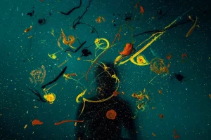
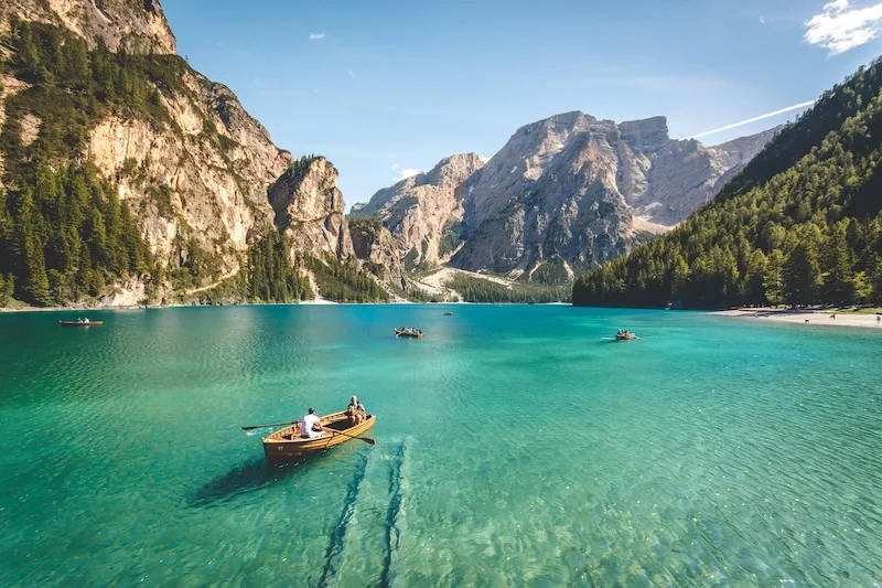
So, when editing a nature photo, it is important to avoid intensifying the pure colors too much, because the shot will lose all its realism, especially since bright colors are rare in nature due to the desaturation caused by the ambient light. On the other hand, when you are looking to create a surreal effect, it is possible to opt for a more pronounced saturation to achieve the desired effect.
Saturate according to the type of photo to be edited
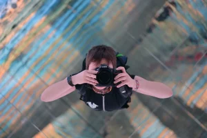
For the sake of realism and consistency between the colors and the subject, it is appropriate to adjust the saturation level according to the type of photo to be edited. This is especially true for portrait photos or photos containing people.
Indeed, in this type of image, the saturation must be as restrained as possible, because if the people are dressed, the slightest exaggeration of the color of clothing, for example, can give the impression that the subjects are covered with paint. Similarly, the abuse of saturation in portrait photos makes the light tones particularly unrealistic.
Reading your histogram
To achieve a successful saturation level on your photos, you can use a histogram. The histograms are, in fact, statistical graphs which make it possible to represent the tonal range or the distribution of colors, shadows and lights on an image.
They are available on digital cameras and photo-editing software programs. By observing them, we can know what level of saturation to adopt on an image without denaturing it and can retain the most important details.
Saturate color by color
Increasing or decreasing the intensity of the colors of an image separately is certainly not a standard rule when it comes to saturation management, but it is still a trick that can help to achieve a successful result.
Specifically, the technique, which can be used with certain editing tools, Lightroom in this case, consists of choosing and highlighting one or more colors while the others are desaturated. This trick requires, however, skill and more caution, as excess and misalignment happen very quickly if you are not careful.

How can you adjust the saturation with a photo-editing tool?
The actual management of the saturation of an image can be achieved through applications and editing software. On some software programs commonly used in photography, namely Photoshop and Lightroom, the operation can be accomplished through various settings presented below.
Adjusting the saturation
To change the color intensity of a photo, use the Saturation slider available on the editing tools. To vary the level of saturation, simply move this slider to the left when you want to reduce the intensity of the colors or to the right when you want to increase it.
Vibrance adjustment
In photography, vibrance and saturation are intimately linked concepts. We speak in particular of vibrance when we’re referring to the slider that allows you to manage the saturation of dull or less vivid colors.
Concretely, the Vibrance slider makes it possible, for example, to accentuate shades of blue. By moving it to the right, we obtain targeted increases in the light tones of an image. Similarly, adjustment of the vibrance makes it possible to avoid supersaturation of the skin tones.
Which slider should you use for good photo saturation?
Although they all act on the color intensity of an image, the Saturation and Vibrance sliders do not induce the same results in terms of color rendition and improvement. You might therefore wonder which is the most effective.
In practice, the Vibrance tool allows you to have a more subtle influence on the tones of a photo than the Saturation slider. However, the Saturation slider also helps to brighten up the images. It is, therefore, important to keep in mind that the two tools are complementary and must be intelligently combined for an aesthetic and realistic final result.
In concrete terms, they can be used in two stages. To do this, you must start by developing the saturation in order to find the right level of color intensity. Then, it is necessary to adjust the vibrance to continue to boost the intensity of the colors until the desired quality threshold is reached.
Moreover, both must be accompanied by other tools that also contribute to the enhancement of the images. This includes the adjustment of brightness and color hues. Knowing the right tools and techniques for photo editing can significantly enhance your work. Would you like to turn your passion into a career? Consider exploring online work-from-home jobs to find roles that align with your photography or photo editing expertise, and take the next step toward building a career you love.